

In this guest post Nada Hasic reviews the data for the solar panels and batteries at Sydney’s Sustainable House.
Nada is a Mechanical Engineering undergraduate student from the United States University of Rochester, class 2021, and an intern at Sydney’s Sustainable House.
Solar power is becoming cheaper by the day, but is it enough to completely sustain any household?
To answer this question, I have looked at the data from Sydney’s Sustainable House solar panels and batteries and tried to analyse and understand some of what goes into supplying solar energy to a house. The owner of the house, Mr. Mobbs, suggested we expand the analysis and see if the system provides enough electricity for him to replace his gas cooktop and oven with an induction cooktop and an electric oven.
This analysis is the fourth in a series about the solar panels and batteries at Sydney’s Sustainable House where Michael Mobbs lives in Chippendale, Sydney. The house first installed solar panels in 1996, but Michael has been completely off-grid for electricity only since March 2015. The initially installed solar and battery system at that time failed, and a new one was installed in July 2018. An analysis of the new system has already been done in April 2019, and this is a continuation of that. With the new system up and running for the last two winters, we have enough data to check how well it has done during the months with the least amount of sunlight.
How does it work?
Understanding the data from the solar panel system might just be the most complicated thing I’ve encountered in a while, and it would have taken me ages had I not had help. Mr. Valantine, the Managing Director and Solar Specialist at MV Solar, who installed the panels and batteries, was kind enough to answer my many questions.
Understanding the data is impossible without first understanding how the system functions. So, before anything else, Mr. Valantine explained that there are two sets of solar panels: one set connected to a solar inverter that feeds energy directly into the house and the appliances, and the second set that feeds energy into the battery until it’s full. When there isn’t enough sunlight to power the appliances on its own, the battery, along with the first set of solar panels, also sends energy into the house. When there is enough sunlight however, and the battery is fully charged, the energy the panels collect gets reduced to the amount needed to only supply the load in the house.
To make sure this explanation is easily understandable for anyone, a diagram of how the solar panel and battery system works is provided below.
A key efficiency feature of the system increases the life of the batteries.
During the day one of the inverters bypasses the batteries with the energy harvested from the sun and takes the energy directly to the appliances, thereby avoiding charging and discharging the batteries and, in turn, increasing the life of the batteries. Batteries last longer or less long depending on the number of times they are discharged.

• How does the solar and battery system work?
Induction Cooktop or Not? Considerations
To decide if an induction cooktop and an electric oven are a good idea, I had planned to just compare the loads to the supply and see if I have enough energy left for more load.
However, Mr. Valantine warned me that there is more to the problem than that. According to Mr Valantine, “You need to deeply analyse the loads that will be attached to the system in terms of:
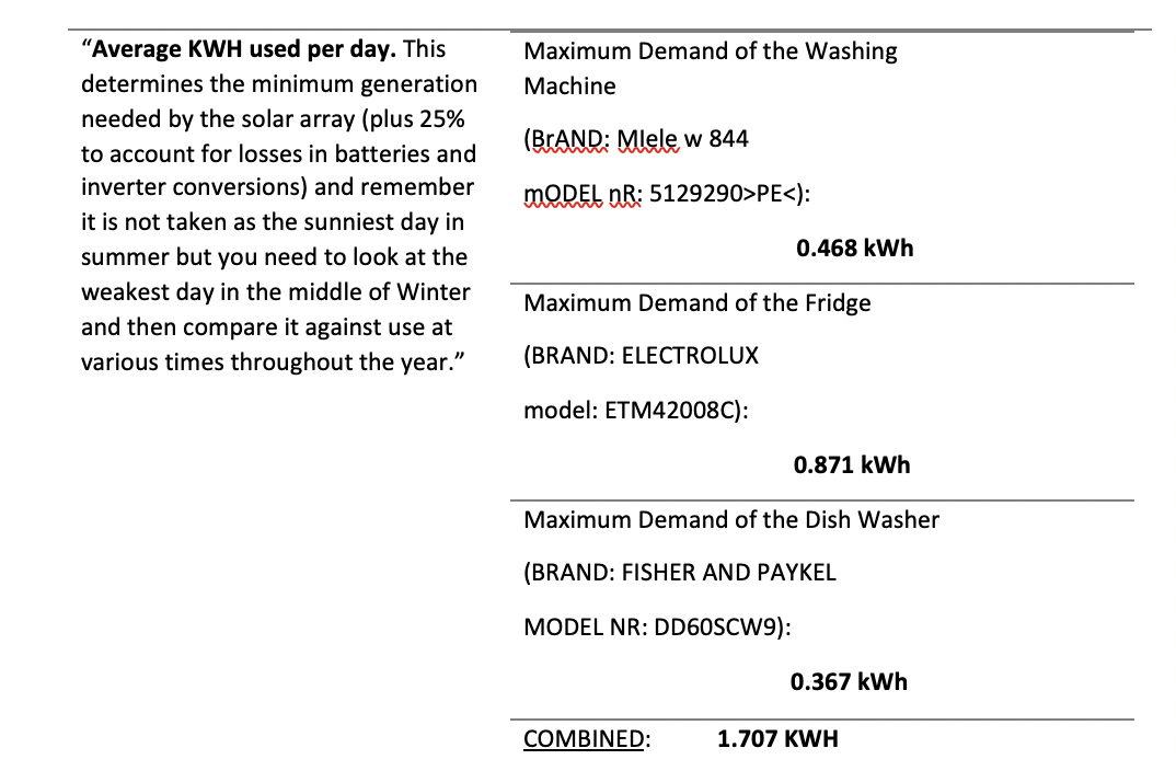
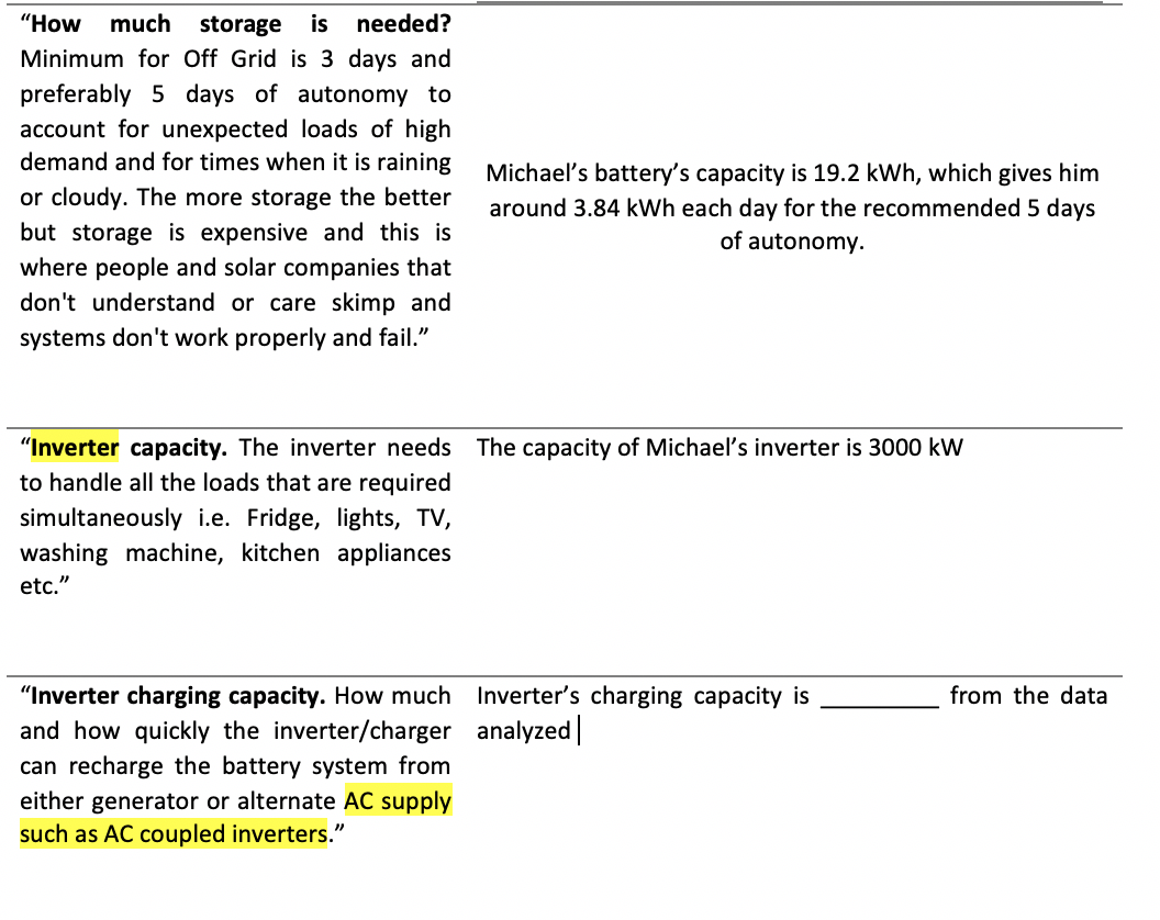

After receiving this advice, I still needed a place to start. Mr. Mobbs’ system does not have a generator attached, so this analysis could show that he might need it. Inverter capacity and its charging capacity seemed like problems I should look at after I determine whether there’s enough energy in the first place, while the automatisation and flexibility seemed like something that should be considered after all the other data have been gathered. So, I started with the analysis of average kWh used and produced per day during cold winter days first. The row dealing with this issue in the table above contains theoretical values, the following analysis will give me a rough idea of how much excess energy I actually have to spare for the cooktop.
Data for Average kWh Used per Day
Knowing the information in the above table helped to get a sense for the numbers that I am about to start analysing. The table is not a good way of determining anything related to the cooktop however, because it is all theoretical. This is why further analysis was needed.
After the table was created, I downloaded the data from the solar panels using a USB connection in the inverter and was left with a massive Excel sheet that needed serious combing through. The spreadsheet I was interested in had about 5953 rows and 36 columns. The data showed detailed activity in the system during 15-minute intervals for each day for the past two months. This is how it looks, zoomed out and overwhelming:

Hours of research and a lot of help from Mike Haydon from 24 Hour Solar Power later, I was able to create four graphs that represent trends in data I was interested in, but first, let’s talk about why the data was so difficult to read
Why Data Was Difficult to Read
The monitoring device that Michael uses for his system is a product by the company called Selectronic, and while we have seen the way data is organised in their Excel spreadsheets above, let’s have a look at how the dashboard for live monitoring looks. The annotations are mine.
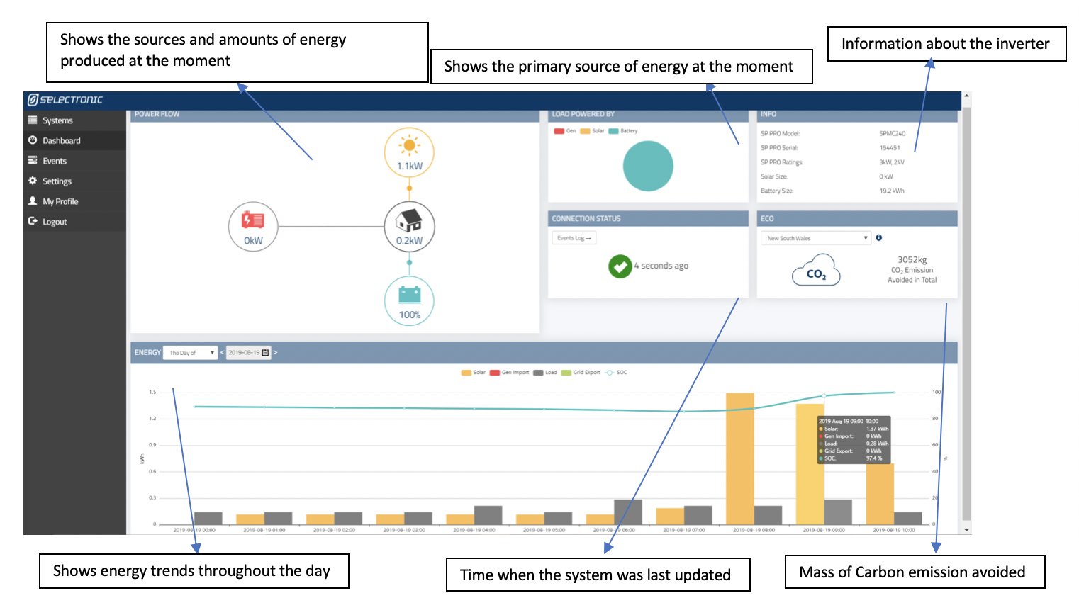
Even after a quick glance at the Excel spreadsheet above, it becomes clear that the data was hardly meant to be read by the average end user who is not in possession of a diploma in electrical engineering, and the dashboard hardly provides any useful data aside from the load and the supply. To make matters truly sad: not even that data can be downloaded from the dashboard! It took hours of research and days of emailing back and forth with experts to be able to create two columns for my analysis: total energy load of the house and total power that can be supplied at a given moment.
If you’re thinking that this is, of course, a very complicated system and its incomprehensibility should not come as a surprise, I ask you to reconsider, because Solar Analytics has shown how data can be simplified and made accessible. It‘s like with cars: a complicated system for sure, but the data for the key points (fuel, speed, km driven, etc.) is clearly shown and easily understood. If car companies can do it, why can’t these people too?
An example of a simple, user-friendly data system is that offered by Solar Analytics and their dashboard (for an on-grid house), annotated by me, can be found below.

Solar Analytics is available for installation only on the grid-connected systems, so I had to work with what I had because the system is off-grid.
Comparison of Selectronic Monitoring System and Solar Analytics
Below is a table comparing two solar power monitoring devices. One device is a product of a company called Selectronic, and the other is produced by Solar Analytics.

A Key Piece of Data
An important difference between the two tables is the fact that the Solar Analytics monitoring system predicts the amount of energy that should be produced at a given time by a solar power system and then compares it to the amount that is actually being produced.
This information is crucial, because it immediately lets the user know if the full potential of the solar panels isn’t being achieved.
The reasons for faulty solar panels can vary: from unfortunate shading over the solar panels, to accumulated snow or dirt, to an actual fault in the system, and faulty installation. However, identifying the problem easily and, more importantly – quickly, can eventually lead to better and cheaper solutions.
Data Collected and Analysed
Eventually, I was able to wade through the jungle that was that Excel spreadsheet, and these are some of my conclusions.

The first graph shows the difference between the load of the house and the energy that was available to supply it. This analysis was done for four rainy days in August, and is a good way to analyze, not just the availability of the energy of the sun, but how fast the battery was discharging too. It is important to note however, that the data was collected for a one-person household, and would look very different had there been more people in the house.
After making this graph, in the same Excel sheet, I created three tables that predicted the energy use in the house after a cooktop is installed: one for high energy use, one for medium and one for low. High energy use means that all three meals will be cooked every day: breakfast will take one hour to cook, lunch will take two, and dinner an hour and a half.
The graph showing the prediction for high energy use of cooktops is below.

The graph above shows that there are many times when the load is larger than what the system is able to supply, which is concerning and does not bode well for the cooktop.
Next is the graph with a medium energy use estimate. This means that all three meals are cooked every day as well, but the time it takes to cook them is shorter. Cooking breakfast would take 15 minutes, lunch would take one and a half hours and dinner would take 10 minutes.
The graph showing this energy use is below.

Data looks slightly better now, but it still seems like the current supply might not be enough.
Moving on, in the next graph I showed the low energy use estimate.

This one has a load very similar to Graph 1 in which there is no energy use by the cooktop at all, which means that the system might be able to power a cooktop as long as it’s used very little, which, in turn, makes me question the point of having an induction cooktop at all.
It should also be noted that these graphs were made using only the electricity that the battery provided because we want to look into a time when there is no sunlight. This means that the graphs aren’t fully representative of the actual supply and demand because even though the days were cloudy and rainy, some sunlight was still available and has powered the house appliances directly as well as charged the battery very slowly.
Also, the data that was available to me was averaged over 15-minute intervals, and the unusual spikes of load in the graph when there is apparently no energy provided at all are probably the result of this.
But this is not all there is to this situation.
Other considerations
According to Mr. Valantine’s advice from above, inverter capacity and charging capacity need to be taken into consideration next, as well as maintaining a flexible system that will not shut down during any long cloudy or rainy period.
The data I have analysed has been collected during a long cloudy and rainy period, which can be seen from the way the amount of electricity in the battery decreases from right to left (28th to 31st of August), so this part has been taken into consideration.
The capacity and charging capacity have been briefly addressed in Table 1. From the graphs above, we see that the total load of the house at its most has reached about 3 kWh, when there was only one person living there. This is without the cooktop. With the cooktop and more people living in the house, this number only increases, and while there might be enough power in the battery to supply large loads for a while, the capacity of the inverter poses the problem. Michael’s inverter is only able to continuously provide 3000 kW of power. Just two smaller cooking zones can demand more power than this when operating continuously and even more after just being turned on. If the entire cooktop gets switched on at the same time to its maximum, it will take up about 8.9 kW for a little while and the most the inverter can provide is 7.5 kW for 30 seconds.
In short, this means that were Michael to add this cooktop to his system, his inverter would only be able to provide enough energy for minimum use, and even then, all other appliances might have to be switched off.
The charging capacity of the inverter is another problem. If we need the battery to discharge quickly because we demand a lot of electricity during cloudy days, we then need it to be able to charge back up quickly too.
If we look at the graphs above, the grey line represents the amount of electricity left in the battery. Towards the end of the trend line (left side), we see that the amount of electricity in the battery has increased. I’ve pulled up the data, located the maximum and minimum at that time and calculated that increase rate was just 0.0068 kWh per minute.
I am far from an expert, but looking at these graphs, it seems to me that the rate of increase and the rate of decrease of the grey line (the way the line curves when it goes up and down) are pretty similar, but if it were to start going down at much sharper angles and continue going up at this rather blunt angle, I think Michael would find himself with a problem.
Conclusion
Most of this blog post consists mainly of estimates and well-informed guesses.
I am merely a university student studying for a degree that is sadly not Electrical Engineering, but after a lot of digging and talking to people who know much more about this than me, I was able to conclude that Michael cannot connect an induction cooktop to his system, not necessarily because of the lack of sunshine that could power it, but mostly because of the limitations of his inverter.
I reckon a good way to fix this problem might be to get a more powerful inverter. However, staying connected to gas is probably the most economically viable solution.
As we can see, however, good data and being able to easily understand it is key to using a solar system just as data is key to getting the best performance out of a car or anything which is used to provide a function or service for day to day uses.
List of definitions:
Inverter – Device that converts the electricity from the solar panel into electricity available for storage or use in a house
AC – Alternating Current
DC – Direct Curent
AC Coupled System – systems that use string solar inverter coupled with an advanced multi-mode inverter or inverter/charger to manage the battery as opposed to just solar regulators that are used in DC coupled systems
List of Columns in Detailed Data Excel Spreadsheet from Selectronic
Using the USB cable provides data on:
• Inverter AC Power (Average) [kWh]
• DC Input Accumulated (Sample) [kWh]
• DC Output Accumulated (Sample) [kWh]
• Battery In Accumulated (Sample) [kWh]
• Battery Out Accumulated (Sample) [kWh]
• DC Voltage (Average) [V DC]
• DC Voltage (Min) [V DC]
• DC Voltage (Max) [V DC]
• DC Mid Voltage (Average) [V DC]
• DC Mid Voltage (Sync Sample at Min DC V) [V DC]
• DC Mid Voltage (Sync Sample at Max DC V) [V DC]
• Inverter DC Current (Average) [A]
• Shunt1 Current (Average) [A]
• Shunt 2 Current (Average) [A]
• Load AC Power (Average) [kW]
• Load AC Power (Max) [kW]
• AC Input Power (Average) [kW]
• AC Load Voltage (Average) [V AC]
• AC Load Frequency (Average) [Hz]
• Transformer Temperature (Max) [Degrees C]
• Heatsink Temperature (Max) [Degrees C]
• Battery Temperature (Max) [Degrees C]
• Internal Temperature (Max) [Degrees C]
• Power Module Temperature (Max) [Degrees C]
• State of Charge (Sample) [%]
• AC Input kWh Accumulated (Sample) [kWh]
• AC Load kWh Accumulated (Sample) [kWh]
• Shunt 1 kWh Accumulated (Sample) [kWh]
• Shunt 2 kWh Accumulated (Sample) [kWh]
• Analogue In 1 DC Voltage (Average) [V DC]
• Analogue In 2 DC Voltage (Average) [V DC]
• AC Export kWh Accumulated (Sample) [kWh]
• Total AC Coupled Power (Average) [kW]
• Total AC Coupled Energy (Sample) [kWh]